KWEH!
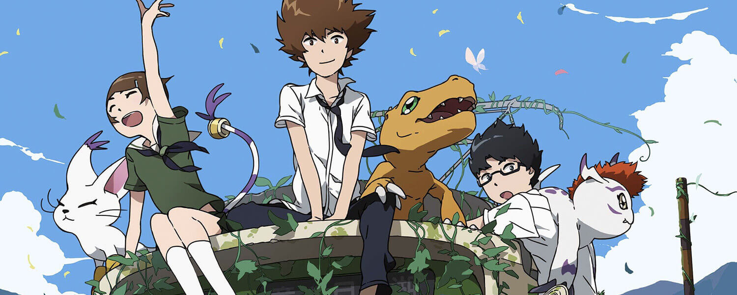
We have seen some of the visuals for the new Digimon Adventure tri. movie series in production. I personally am quite excited as I grew up with the series and am still fond of the concept even more than the other…erm…super popular monster-catching series.
However, as excited as I am for the new Digimon Adventure tri. movies, I could not help but notice the leap in character designs for the DigiDestined teens. Yes, the original series has very stylized character designs that still resonate in the minds of fans, but the new character designs have rather soulless expressions and sort of laid back, uncaring body language. While the reasoning behind the more static body language may come from the DigiDestined maturing, that same reason should not apply to their lazy and lifeless eyes.
A fan by the screen name of Ebisu proposes a reasonable series of changes to the eyes of the teenagers. In his own words:
“After the release of official images and teasers, many people online have come away with the opinion that ‘the new designs seem strange.’ The new designs look different from those in the original Digimon Adventure, as you can easily tell from looking at the images. As such, you can surmise that people find them strange. Many people are saying they don’t think they can get excited about the new anime because of this, so I am calling for an improvement to the Digimon Adventure tri. designs.”
Let’s see a couple of his proposed redesigns, with Ebisu’s proposals on the top left and the key visuals on the bottom right:
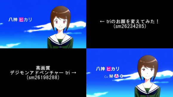
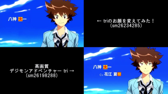
I really like the redesigns! Hikari’s eyes still show that gentleness and positivity whereas Taichi’s eyes retain his assertiveness and readiness. Ebisu also takes into consideration that the series may have been in production for some time and substantial changes may no longer be plausible.
If you search around the Internet, you are bound to find many fans trying to compare the older styles and the new ones. Some of them even tried to redesign the characters a tiny bit. Here are a couple that I found:
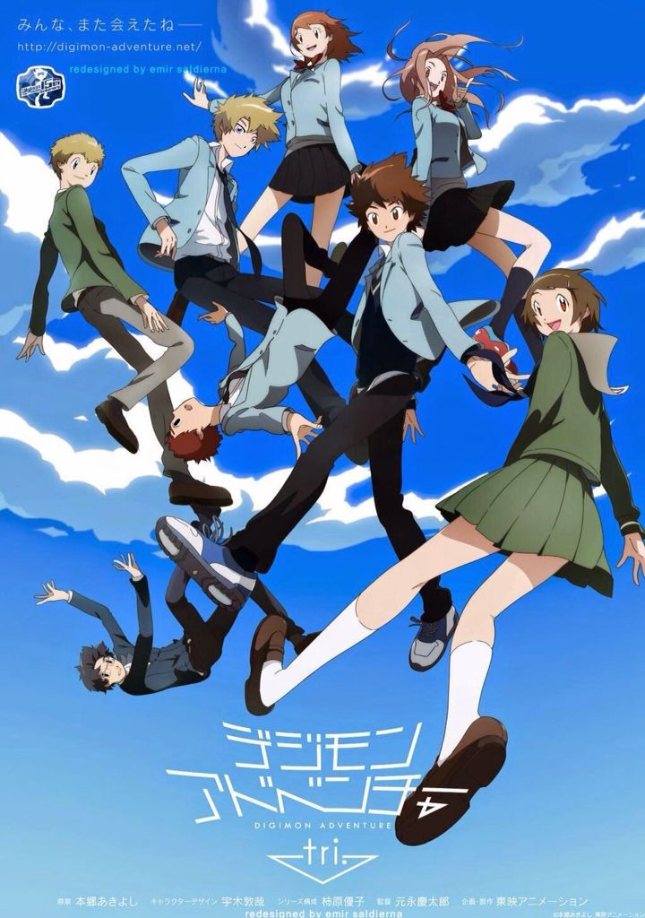
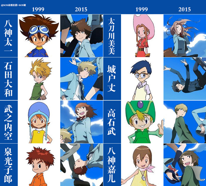
Are we asking too much? Could, at the very least, redesigning the eyes to be more expressive and true to the original personalities be afforded? What do you think, Yattans? Let us know in the comments!
Source: RocketNews24

Featured Sponsor - JAST
The sweetest romance and the darkest corruption, the biggest titles and the indie darlings; for visual novels and eroge, there's nowhere better.
Big thank you to our supporters
From their continous support, we are able to pay our team for their time and hard work on the site.
We have a Thank-You page dedicated to those who help us continue the work that we’ve been doing.
See our thank you page