English-language manga is a booming business these days, especially digitally. Most of the major players’ books are available on various digital storefronts, while small publishers are popping up and building an audience on digital-only doujinshi releases and indie comics. And, of course, subscription apps are being developed to bring as many of these manga as they can under their umbrellas.
Azuki is one of the newest of those services, and there are plenty of reasons to be interested. For one, from launch, it has a huge chunk of Kodansha’s manga library, as well as a handful of releases from Kaiten Books, amounting to over 170 series. It’s also created and run by ex-Crunchyroll staffers, so we can reasonably assume that the people behind the scenes are not just fans of the medium, but are also familiar with the industry and know what they’re getting themselves into.
But Kodansha and Kaiten Books’ manga, including simulpubs, are available from other outlets, both subscription-based (like Mangamo, Comixology/Kindle Unlimited, and Crunchyroll Manga) and purchase-based (Comixology/Kindle, NOOK, Bookwalker, etc.)
So what makes Azuki worth your money and attention?
To find out, I got my hands on a subscription and checked out the web version on both my laptop and my Android phone, and the Android app. The first thing I noticed about it, on both web and app versions, is how nice it looks. It has a surprisingly understated layout and color scheme, but it’s not bland. The edges of the series thumbnails, and most of the buttons and fonts, are rounded off. Banners, titles, and buttons use a soft red and blue pallet. The whole thing is very easy on the eyes.
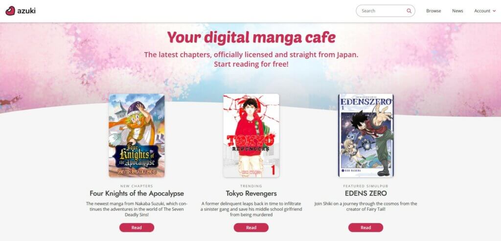
Outside of the reader, the site and app are generally easy to navigate. Menu buttons are right where I expected them to be. The home page breaks their offerings up in ways that are useful and interesting, with simulpubs, new releases, things you’ve read recently, and staff-curated categories all a tap or click away. You can click a series name or picture to be taken to a page that has a summary and chapter list. Some staff-curated series on the home page also show a big red Read button that takes you straight into a chapter from the home page.
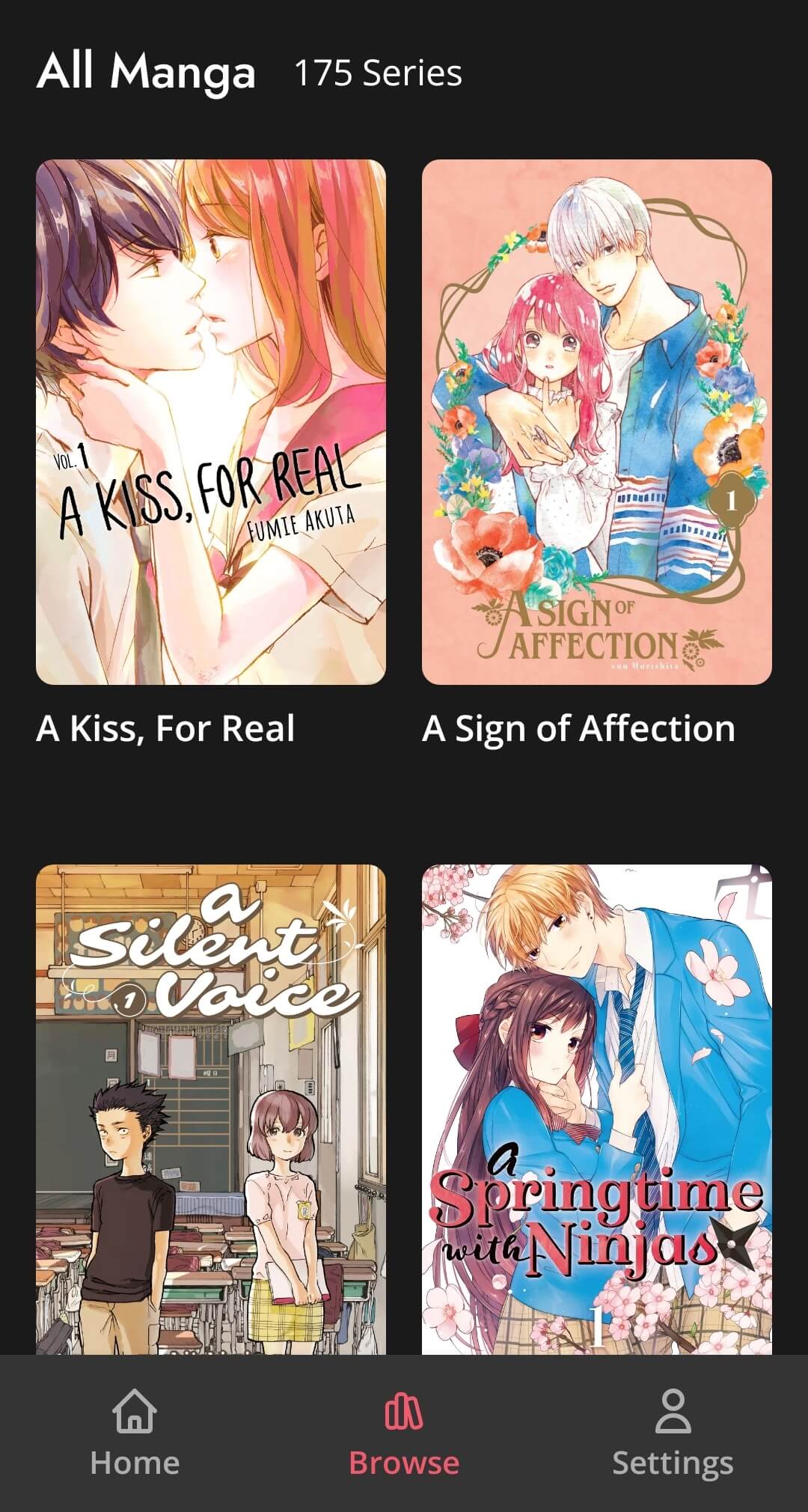
If you don’t see what you’re looking for on the home page, you can search for it – if you’re on the web version, anyway. The Android app has no search function at all, though they’ve announced it will be coming soon. If you want to find a series that’s not offered to you on the homepage, you have to scroll through the entire list to get to it.
The search function on the web version can only search by title, not by author/artist or any other potentially useful terms. That’s by no means a dealbreaker, but as their library expands and they start offering multiple manga by the same creators, I expect some users will wish they could search a name to find everything from an author or artist they enjoy.
Azuki’s Reader UI & Functionality
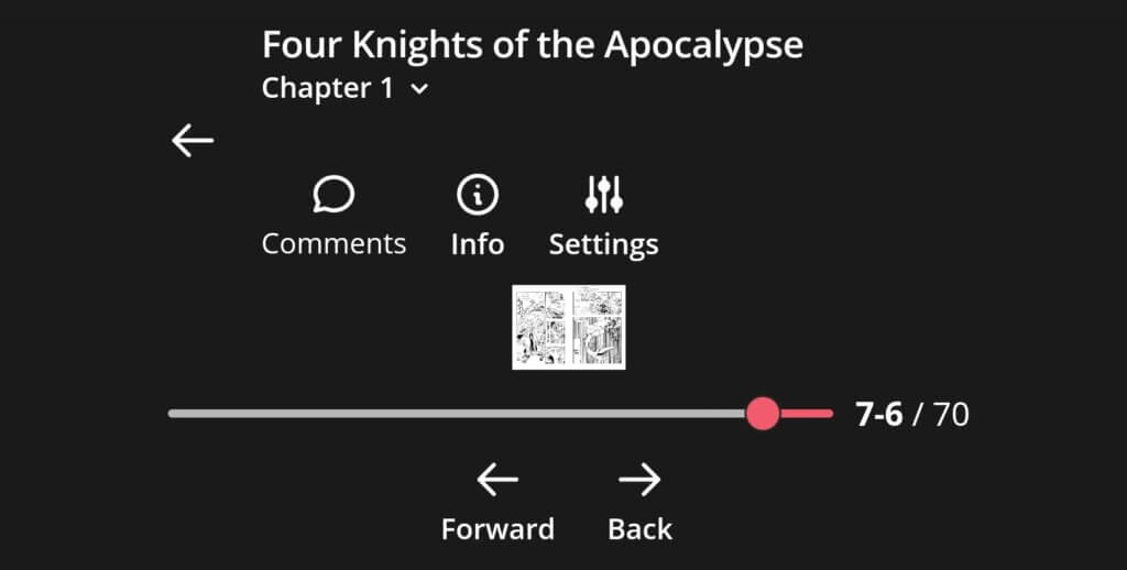
The reader portion of the site and app, for the most part, is excellent. The image quality is super high, with deep blacks and little to none of the screentone moire that shows up in some digital manga. On the web version, there are three different reading layouts to choose from – flipping from a single page to the next, flipping between two-page spreads, and scrolling vertically through all the pages in a line. On the layouts that require page flips, you can do so with either of two buttons, at the side and bottom of the screen. You can also scroll through pages faster by dragging the chapter progress bar, and you can zoom in on pages if the text is too small.
I appreciated the fact that you could zoom in because, on my laptop’s screen, both single pages and the two-page spreads default to a somewhat small size. But the image still looks great even when zoomed way in. This wasn’t quite the case when using the web version on my phone. On the single page and vertical scroll settings, the image stayed high quality. Double page spreads didn’t always, though. In portrait orientation, everything worked fine, but when I rotated my phone to landscape orientation, the page got so tiny that I couldn’t zoom in far enough to even read anything.
This is weird, but not really that big of a deal because most people who are reading on their phones are going to use the app version, right? Except on the app you have far fewer options to customize your reading experience. I was hoping that turning my phone sideways in the app would immediately switch it to the two-page spread layout, but it turns out the app doesn’t offer the two-page spreads at all. If you turn your phone sideways, it just shrinks the page to fit and adds a bunch more black space on either side. And since you can’t zoom in at all on the app, there’s basically no point in turning your device sideways, which is disappointing.
In the single-page layout, you can flip pages with a swipe or a tap on the side of the screen, and you can bring up the menu by tapping the center of the screen. But the center stripe that brings up the menu is pretty narrow, and I occasionally found myself flipping pages when I was trying to bring up the menu.
One other tiny gripe I had was that on the web version, if you click the series name at the top of the page while reading a chapter, it brings you back to the series page so you can see its summary and chapter list. But this doesn’t work in the app – you can’t click the name at all. Both versions have a back button right next to the name that takes you back to whatever page you were on last. This button is your only way to exit the reader on the app, meaning that if you jumped straight to the chapter by clicking the Read button on the home page, you have no way to go from the reader straight to the series page. It’s a corner case I suppose, but it was frustrating that something that worked in the web version didn’t work in the app.
All in all, the app currently leaves a bit to be desired, but the web reader is one of the best out there. In nearly every case it works smoothly and looks great, and Azuki’s catalog is impressive. They don’t have every published chapter of every series yet, which will bother some potential users. However, gaps in series are clearly noted, and their social media team posts frequent updates on Twitter about what is being added and when. I’m sure Azuki will improve with time, but even as it is now, its sizable and varied catalog and generally smooth reading experience make it absolutely worth trying, at least for a few months.
You can check out Azuki by visiting their website or download their app, which is available on iOS and Android!
Many thanks to the staff of Azuki for allowing us to access and share our thoughts on the Beta version of Azuki’s website.
The Good
- Large and varied catalog from day one
- Browser reader works well and is easy on the eyes
- Great social media presence with clear and frequent updates
The Bad
- Android app is missing some important functionality at time of review

Featured Sponsor - JAST
The sweetest romance and the darkest corruption, the biggest titles and the indie darlings; for visual novels and eroge, there's nowhere better.
Big thank you to our supporters
From their continous support, we are able to pay our team for their time and hard work on the site.
We have a Thank-You page dedicated to those who help us continue the work that we’ve been doing.
See our thank you page