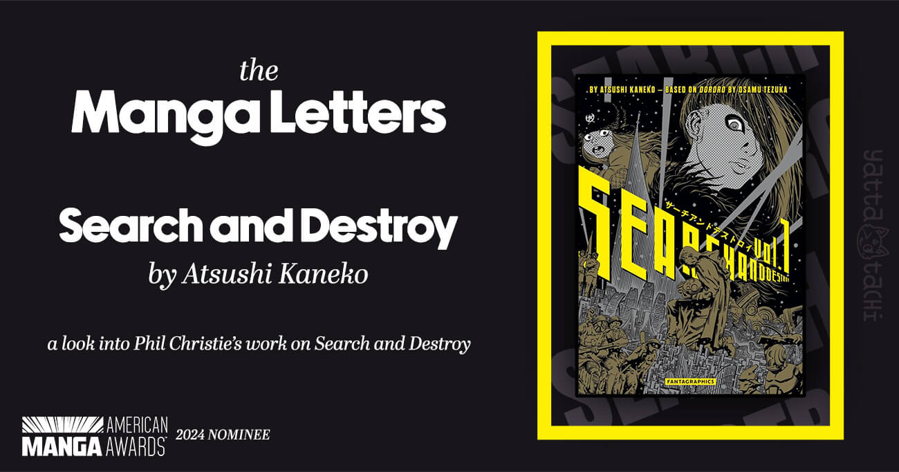
When thinking about what manga I wanted to review for the very first article in my new lettering series, I immediately knew where I wanted to start. Phil Christie’s lettering for Mangasplaining Extra on Atsushi Kaneko’s Search and Destroy is some of his best work.
Sound Effects
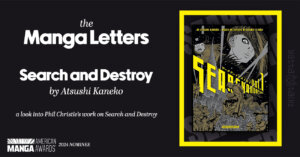
The sound effects in Search and Destroy have so much character. Christie lettered them on paper before scanning and digitizing them so that they would have a similar line quality and gravitas as the original art.
Drawing a single good sound effect like this, especially with analog methods, is a feat in itself. Not only does Christie create beautiful sound effects, he also manages to keep the same voice for all of the sound effects across the chapters. This would be easy to achieve with a font, but remember that Christie is drawing each one of these by hand.
Christie is also a type designer, and you can see this in his letterforms. He draws S’s and O’s in a boxy shape with corners where they shouldn’t be, and yet the sound effect is still easy to read. The letters all have a uniform shape, with an ever-so-slight organic wobble.
The sound effects are so intentional that you can almost see the original Japanese sound effects showing through. Christie has the tremendous ability to craft something new and beautiful while honoring the source material.
Typesetting
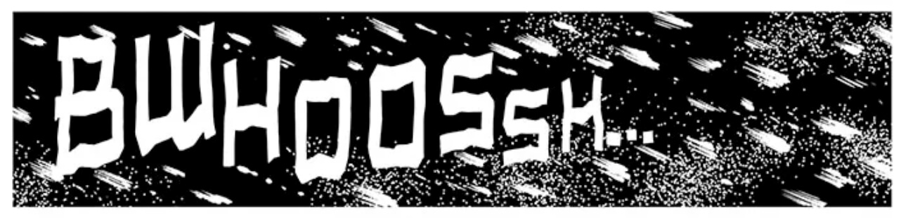
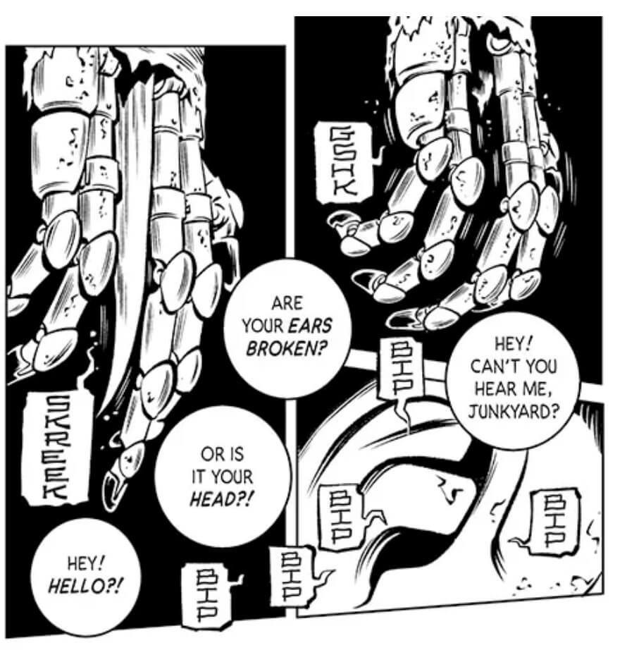
One aspect of lettering that is often taken for granted is typesetting. Christie expertly shapes the translations into the balloons, mimicking the round shape of its line. Notice how all of the text is relatively the same size across balloons, despite the different lengths of text and sizes of balloons.
Text formatting might seem easy, but Christie is following a long list of typesetting rules to make the translation so readable. For example, none of the words are hyphenated, and the personal pronoun “I” is using a dedicated glyph that has crossbars on the top and bottom.
More information on comic book typesetting can be found on letterer and type designer Blambot’s website.
Fonts
The font that Christie uses to typeset the dialogue is Comicraft’s Brian Bolland. Comicraft makes many of the fonts used by the manga industry, but Brian Bolland isn’t used very often. This choice makes the dialogue more visually interesting for regular manga readers.
he balloons are drawn with a good amount of horizontal space, which meant that Christie wasn’t as limited in his font selection. If the balloons had been drawn narrower, Christie may have had to choose a font where the letters are all designed to be slim, like Comicraft’s Samaritan Tall. Since balloons in manga are typically flattened into the art, manga letterers have to be conscious of the horizontal width available for typesetting when choosing a font.
This font, Brian Bolland, has simple, classic letterforms, and it complements the art in Search and Destroy very well. Like many comic book fonts, Brian Bolland is inspired by the work of its eponymous cartoonist. Bolland is arguably most famous for illustrating the 1988 graphic novel Batman: The Killing Joke, which was hand-lettered by Richard Starkings with a pen.
Lettering dialogue by hand is very rarely done today because of editorial and budget constraints, and it’s no surprise that Christie is using a font for this comic. But even if every modern manga uses fonts for dialogue, all of those fonts are inspired by the hand-lettering traditions of American comics. Manga localization is a conversation between comic artists across the globe.
Let Me Gush a Little
I’m certainly not the first person who’s loved Phil Christie’s work. His lettering on Search and Destroy was nominated in the inaugural American Manga Awards’ Best Lettering category. I had the honor of being invited to this event in New York City and reading his name in the list of nominees on stage.
I think Phil Christie is one of the best letterers in the business. He has spent years crafting techniques to letter manga, from digitizing analog assets to making his own, custom fonts. With all of that experience under his belt, he’s able to look at a page of manga and know exactly how to bring it to life for English readers.
Manga localization is inherently an additive process, so when the localization team includes talented artists like Phil, the final product shines. It’s something new and beautiful, familiar yet striking.
Read It for Yourself
The first chapters of Search and Destroy can be found on Mangasplaining Extra’s Substack, and the rest can be read online by subscribing. The print version is out now from Fantagraphics.
Search and Destroy by Atsushi Kaneko, Chapters 0-12
©2023 Tezuka Productions
Translator: Ben Applegate
Letterer: Phil Christie
Editor: Christopher Woodrow Butcher
Article Edited by: Anne Lee
Big thank you to our supporters
From their continous support, we are able to pay our team for their time and hard work on the site.
We have a Thank-You page dedicated to those who help us continue the work that we’ve been doing.
See our thank you page