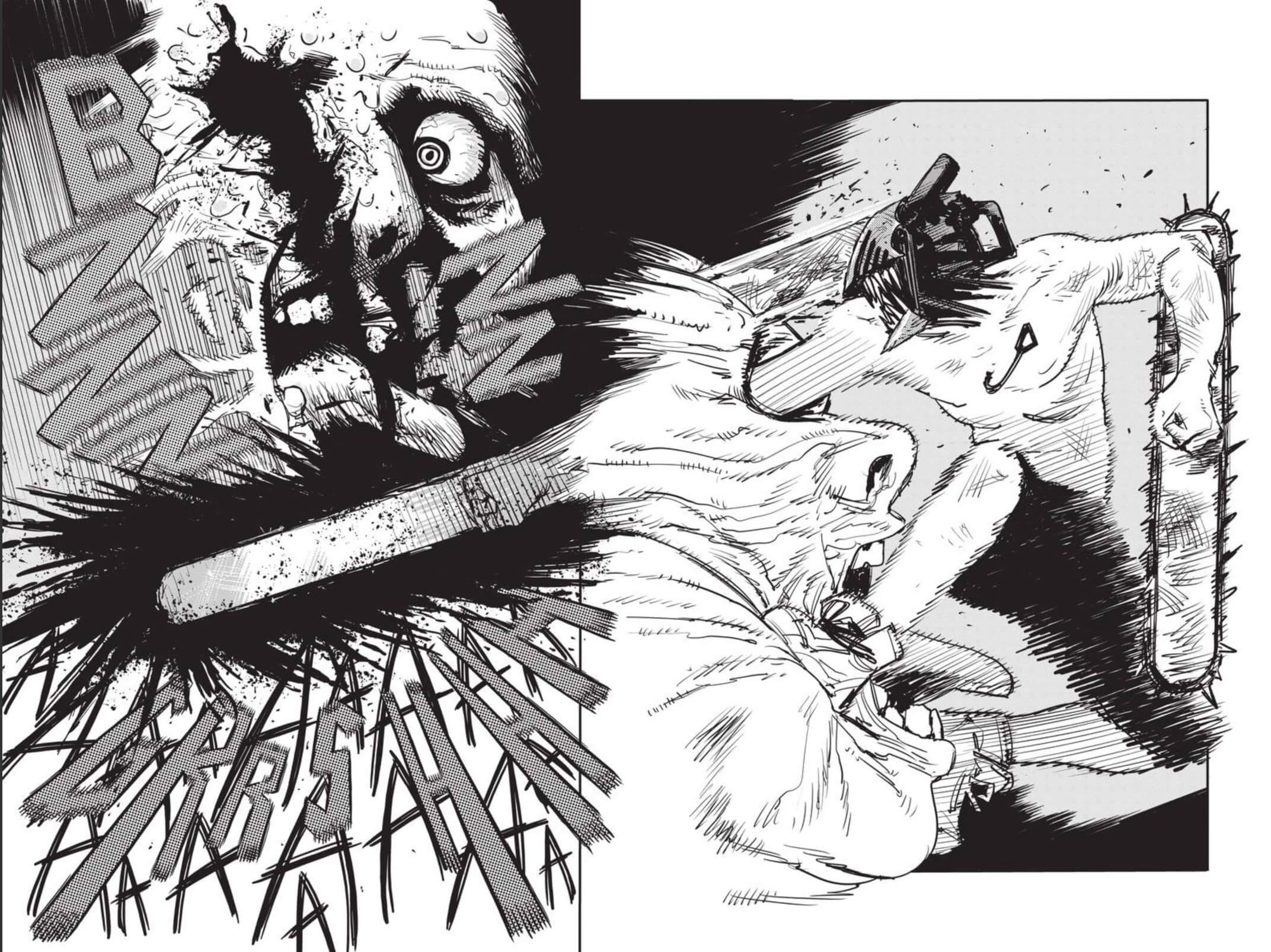
Content Warning: This interview contains example panels from Chainsaw Man featuring blood and gore.
Some of the first manga I ever bought was the Shojo Beat magazine. If I scraped together $5.99 plus tax, I could purchase a smorgasbord of the hottest shojo manga. Official digital manga wasn’t a thing back then. So every time I could get my hands on a physical volume, it felt very special.
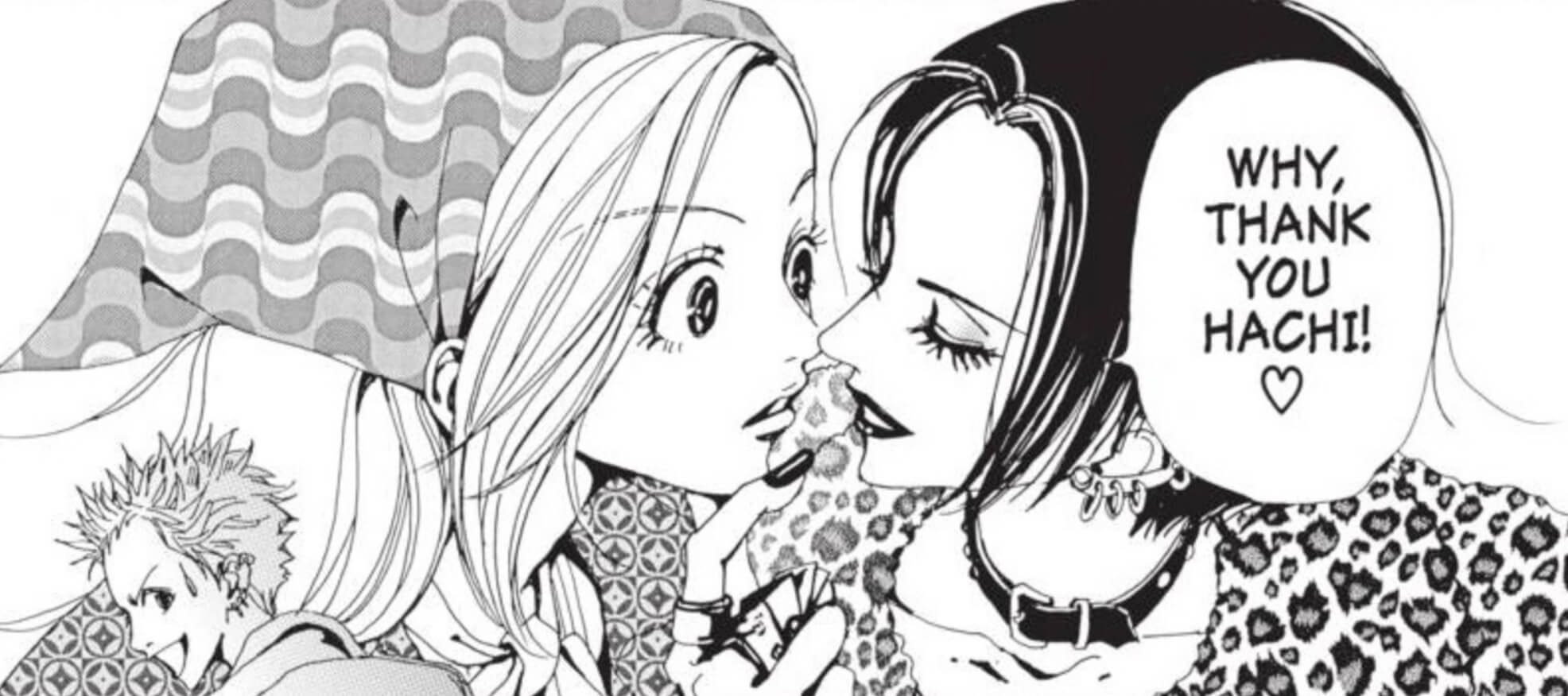
Nana by Ai Yazawa was often featured in the Shojo Beat magazine, and it was one of my favorites. I remember mentally comparing the localization quality to the scanlations I was used to reading and having the first inkling of an opinion about lettering. In many ways, the lettering in Nana inspired my own lettering career.
I recently got the chance to ask my hero and letterer of Nana’s English release, Sabrina Heep, some questions. She reflected on her process, her struggles, and how the manga localization industry has changed in the last 20 years. Please enjoy.
This interview has been edited for length.
I was so incredibly nervous when I opened my first page of Nana and realized my work would be seen by thousands
Nana is one of the most beloved manga for people my age. It was the first series you ever lettered, right? Can you tell us a little about how you wound up on that project?
It all came down to the editor who hired me, Eric. He turned out to be a very chatty guy who would call me up just to talk. In one of our conversations, he said he’d been almost ready to hire me after my first set of sample pages. He also said not every editor was willing to train up a new letterer. I guess I lucked out!
I had no idea Nana existed and had never read a single page before I began lettering it. I had been an anime and manga fan for 9 years when I was hired for Nana, I’d just never happened across it.
I was thrown into the deep end on Nana. It wasn’t a battle manga, of course, but those concert scenes were complicated. I am so grateful that Vivienne Westwood and her legal team didn’t mind her logo and clothing and jewelry designs throughout the series. That saved me so much time!
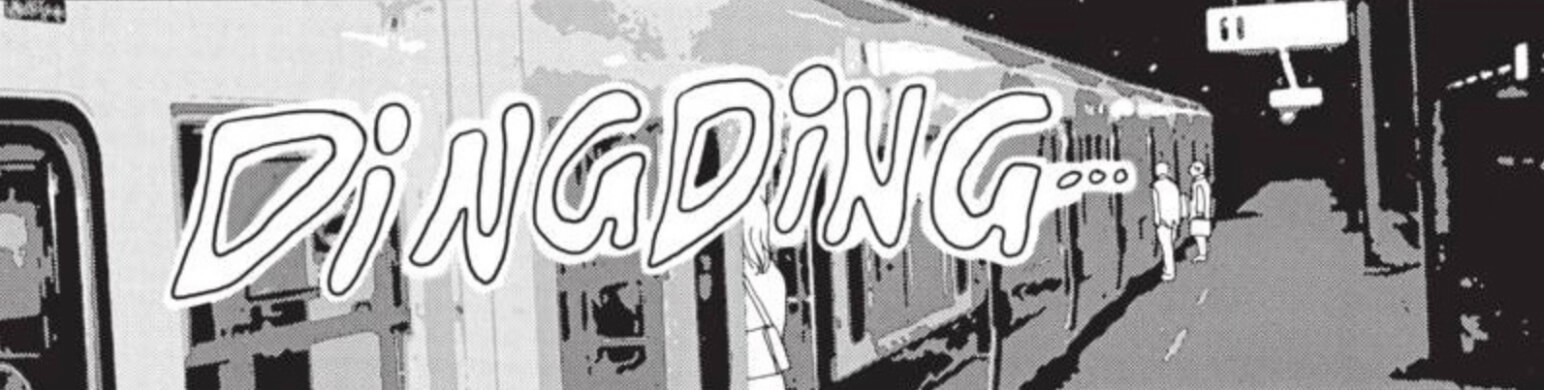
The sound effects in Nana are all hand-lettered, and they give so much life and expression to the translation. Why did you choose to letter all the SFX by hand?
It was a combination of things. The lettering instructions said to match the original Japanese FX style and placement. I could see the FX in Nana were hand drawn. I wanted to match that aspect, too, out of respect. And to be honest, my Photoshop skills back then were pretty basic.
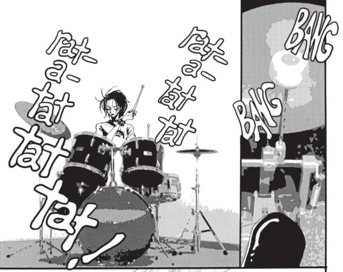
I vaguely knew that type could be warped and changed to make FX, but I had no idea how to do it, and it seemed overwhelmingly complicated to figure out. Just using my lovely drawing tablet and doing the FX by hand was so much easier! I’ve kept up the hand-drawn FX to this day. But in the same vein of respect, when the mangaka uses type FX, then so do I.
When I began lettering random Naruto volumes, I needed to match the established English style, which forced me to learn how to create FX with type. I could see how it saved time by creating instant and readable words on the page. But I also saw how much more retouch was required to cover up the exposed original Japanese, visible around the type. Hand-drawn FX are the ultimate in customization. They do take more time to create, but it saves you retouch effort by more closely matching the original FX’s footprint.
I asked my editor for Naruto if I could include hand-drawn FX in my books. He agreed, but asked me to use them sparingly. I saved them for the pages with the worst retouch. If you’re reading one of my Naruto volumes and notice a big hand-drawn FX instead of the usual type, now you know why!
I had to draw the top half of Naruto once. He’d been covered by part of a huge Japanese FX, and I couldn’t make my hand-drawn English FX cover him up while still being readable. I finally gave up and just drew him in. So that particular Naruto from the waist up is entirely by me!
The nipple erasing only lasted for the first few volumes
From your perspective, what was the manga localization scene like back in the early 2000’s? How does it compare to now?
Back then, it seemed companies were much more concerned with content issues, especially with the books for younger readers. When I started lettering in January ‘05, the industry had already moved to not flipping manga and not sacrificing so much art with our English FX, so I missed the biggest localization changes.
Once I began lettering for younger audiences, though, I was asked to change more things. I removed at least two raised middle fingers. I also added a lot of towels in hot springs or bath scenes in Naruto, added some strategically placed steam clouds, and added or expanded underwear a few times, as well. We had running orders to raise Tsunade’s neckline halfway up her chest and to erase any smoke or burning ends from lit cigarettes.
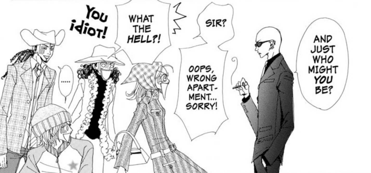
Notably, the famous BL moment between Sai and Sasuke was silhouetted. We went through several different versions of sanitizing that panel before the plain silhouette was chosen. It was a whole process. Even for older readers, I had to do the occasional content change.
Theoretically, all the Naruto changes were only for the print [Shonen Jump] magazine version, while the graphic novels would have the original artwork.
When I began lettering Claymore, I erased nipples from the women’s breasts, and removed male exposed genitalia from the yoma. The nipple erasing only lasted for the first few volumes, though. My editor later told me they’d put the nipples back in place before printing. Alas, no male packages were restored. No equality! Later on, the mangaka himself designed naked male monsters without genitalia, or kept them in shorts. I don’t blame him for wanting to preserve his artwork.
Localization has eased in regards to content
I believe Nana was meant to be a gateway manga here, to show North America that manga could have more mature storylines. To make it accessible to your average reader, the dialogue in particular was fully adapted. The script was sent to a rewriter who was a band vocalist herself, and she went all-in to make the dialogue sound natural to NA ears in more than just band and punk rock lingo. One of the first examples that I can recall is Shin-chan describing himself as a “bishounen,” or beautiful boy. It was changed to “hot guy” instead. I think nowadays, it would be more literally translated as “pretty boy”.
One artwork change for localization that I truly regret is when Ren named Hachi and Takumi’s daughter, Satsuki Ichinose, by writing out her name in beautiful calligraphy. I had to white out his artwork and replace it with the name in English. I tried to make it beautiful, too, but I really wish we could have preserved the original calligraphy and used a footnote translation.
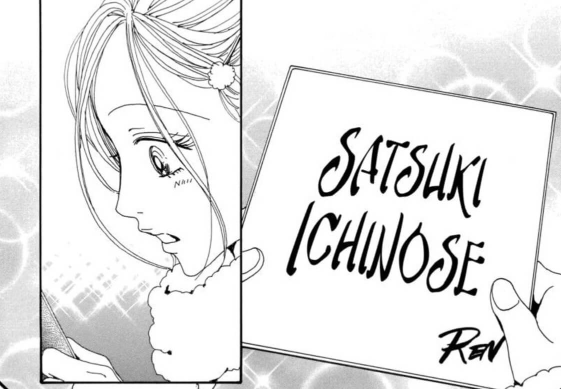
When Hachi was pregnant, they jokingly named the baby “Sa-chan”, short for “Sachiko”. Ren chose the name “Satsuki” because that fit with the already established “Sa-chan” nickname. In our English version, “Sa-chan” had been changed to “Li’l Sachi” to localize it, and so Ren’s reasoning for “Satsuki” no longer made sense. But even now, whether Ren’s calligraphy would be preserved or not would depend on the editor’s choice.
In cultural localization, things seem easier, but I believe the level of localization largely depends on the editor in charge of a book. If they want every store sign and food label lettered, then it’s done. If they don’t seem to care unless it’s important to plot, then things are left as-is. This applies to phone buttons, too. Sometimes we leave them in Japanese, sometimes we do a literal English translation, sometimes we replace the keys’ labels with what they would be on an English-speaker’s phone.
Nowadays, it seems localization has eased in regards to content. I haven’t had to remove nipples or add underwear or towels in years. Female undies or outright nudity are all over Chainsaw Man, and are left intact.
Another example that I really appreciate is intact honorifics. Personally, I like the insight into relationships that honorifics give the reader. How do you show the differences in meaning with English between “Denji-san”, “Denji-kun”, “Denji-sempai”, or just “Denji”? Thankfully, they are becoming more widespread in English versions.
Lettering in 2005 vs 2025
InDesign, Photoshop, and (to a lesser extent) Illustrator are the main tools letterers use today. What did you use to letter and retouch Nana?
Everything was done in Photoshop back then. The pages arrived flattened, with the text and logos as part of the image. In a series like Nana, with a lot of floating captions printed directly over the artwork, that meant extra retouch. But since we applied the text in Photoshop, too, I didn’t have to completely erase the Japanese. I only had to patch what was still visible around the English. The retouch didn’t have to be absolutely perfect, so I could hide misaligned tone or other shortcuts underneath the type.
Nana was finished completely in Photoshop. By the time we made the switch to lettering in InDesign, the series had already wrapped.
The most difficult time for lettering was the overlap between the original pages arriving with flattened text on the artwork, and lettering in InDesign. You had to completely erase the Japanese with flawless retouch, since you couldn’t predict where the text would end up being placed, and couldn’t use the time-saving under-the-type trick. When books began to arrive text-free, or with text on a layer that I could switch to invisible, it was amazing!
I have never had raw pages sent without FX or with FX on their own layer. The FX has always been part of the artwork, and has to be retouched the old-fashioned way. Sometimes books will still arrive with chapter titles flattened on the page. I’ve learned to check the title pages with each volume I start, to see if the titles are flattened or not. And omake author’s note pages are always flattened! They can be hell, because they are usually very dense with content.
When you’re lettering the simultaneous release (simulpub) for Chainsaw Man, how do you handle the dilemma of wanting to produce a high-quality localization, while also meeting deadlines?
Aye, there’s the rub! I do what I can, when I can.
A new scene in the story began with Chapter 136, where Denji is wearing one of his Chainsaw Man branded shirts. The script said nothing about lettering the shirt, or even providing a subtitle in the margin. I could read the shirt, and I had the time right then to get fancy, so I went for it and lettered that shirt every time the original showed the Japanese writing. He wore that shirt through chapter 141, and I lettered it every time Fujimoto-sensei did!
I do have to compromise, though. In Chapter 138, there’s a big poster of Asa advertising the Chainsaw Man church. The poster was close-up in the first panel, then repeated over and over in another, zoomed-out panel, where copies had been taped to the wall in 2 rows. I fully lettered the big version of the poster, but let all the little ones go. I just didn’t have the time to do them all for the simulpub version. But I did for the print graphic novel version (GN).
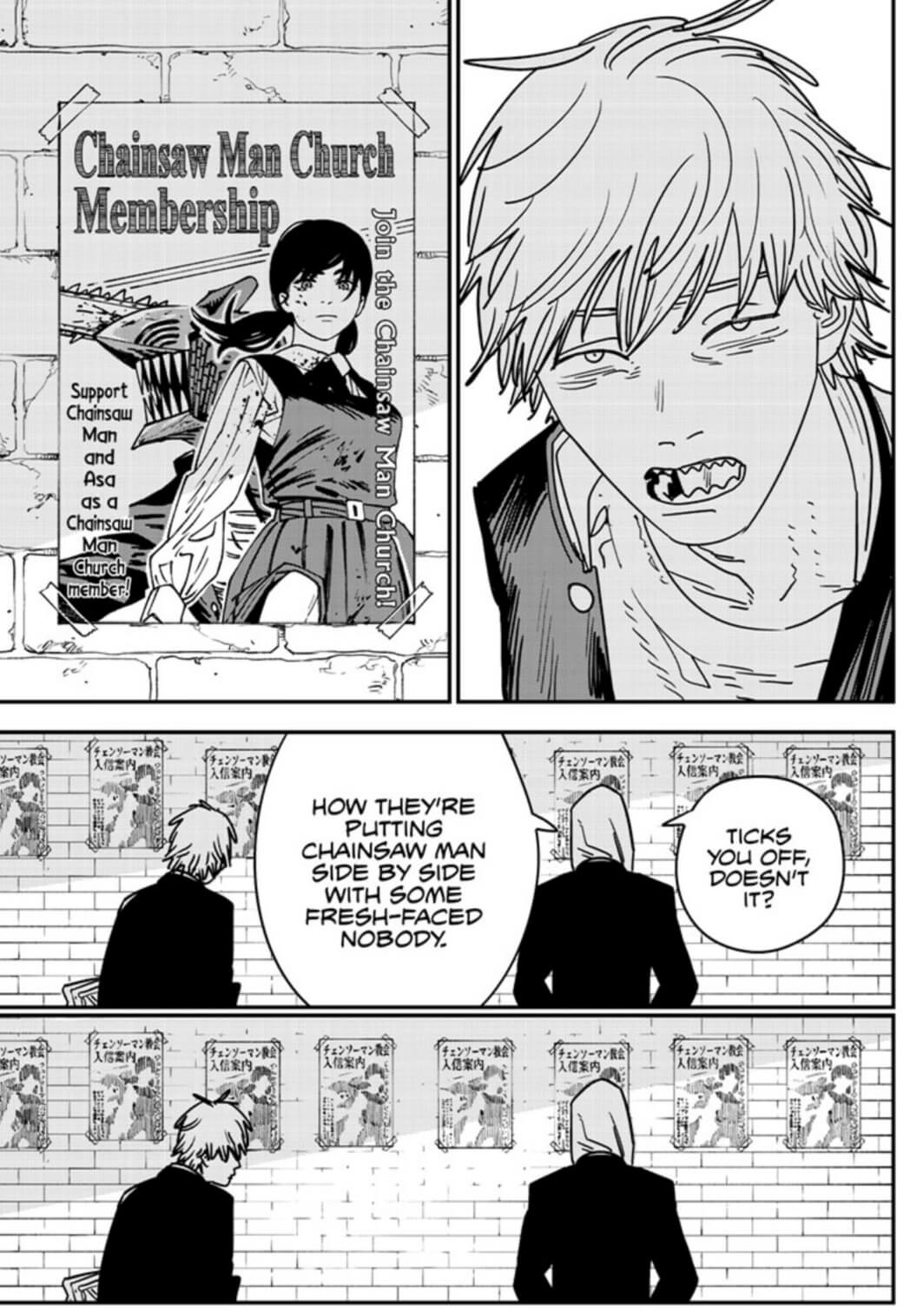
When it comes to FX in the simulpub, we leave the original Japanese as-is, unless it’s in a word bubble, or something spoken. If the script doesn’t tell me to retouch it and I do have the time, then I’ll dive in. Like the repeated posters in Chainsaw Man, I’ll fully retouch all FX when it’s time for the GN.
I’d love to fully retouch everything for the simulpub versions, but it isn’t possible. I do have a lot of pride in my work, and want to do the best job possible. I don’t like cutting corners, but I’ve learned that it can be necessary. Pick your battles, right?
My job is to be invisible
Your impeccable sound effect treatment is a defining aspect of your lettering style, but I can’t even imagine how long it takes to render some of the SFX in the graphic novel release of Chainsaw Man. What motivates you to always go above and beyond? What do you think it adds to the reader’s experience?
I have two motivations. First is respect for the original work.
Anyone who tries to draw their own comic or manga realizes how difficult it is to make just an okay story, let alone one worthy of praise and admiration. How much effort it takes to make the characters recognizable on every page, draw clothes and scenery, craft action scenes, and create fun sound effects. Pacing is crucial and can make or break a story, which has to be told through words and pictures alone. Professional mangaka have mastered that art. They have my profound respect.
As a manga letterer and retouch artist, it’s my job to bring their work to the English-speaking audience in the most authentic way possible. I’ve been telling people for years that when I do my job correctly, the reader could believe the page was originally created in English. My job is to be invisible, and to let the mangaka’s work shine.
My second motivation is professional pride. When I began reading English manga lettered by others in the mid 00s, I realized how different my own style was. Everyone else used type for FX. But here I was with my hand-drawn FX. At first I was embarrassed. The other letterers obviously had figured out how to use type to make FX years before I did. At the same time, we were supposed to match the original Japanese FX, and those were almost all done by hand. Why were typed English FX even allowed?
Eventually I realized that most Western comics had type FX added on top of the completed artwork. That had been the style for decades, and so the English letterers were reflecting that influence. Also if you have a set library of FX fonts to use, then different people can letter the same series, and most readers will have no idea of the switches.
I accepted that with my exclusive hand-drawn FX, I was the odd one out. But my editors never told me to stop. When I had feedback from the Japanese editing teams, it was never about my FX, so I just kept going. My apparent uniqueness became a source of pride, especially as I was offered more difficult and complicated works. I realized I was being hired because of my style. I was doing something that pleased other people, it made me happy too, and I wanted to keep doing it to the best of my ability! So I did.
A mangaka choses their particular visual style for their story. For the reader to have the closest experience possible to that style, it must be preserved. Authenticity!
It was a combination of my skill set, good timing, and luck.
How did you first get into lettering?
An online friend told me that VIZ was hiring manga letterers. He knew I’d been doing a little scanlation work on my own, and maybe I’d want to go legit. In a rare act of bravery for myself, I decided to apply, and sent a small, disposable hard copy portfolio of artwork along with my resume. Then I was emailed information from VIZ to make my first set of sample pages, from Angel Sanctuary.
To be honest, I started lettering without any idea what was standard or the trend at the time. I dug out my old flipped VIZ Ranma books and used those as reference. I had no idea what others were doing outside of those old original Ranma volumes, as I hadn’t picked up anything else in English for years.
If there were online resources for letterers back then–comic or manga–I had no idea how to find them. So I did what looked and felt right.
A couple weeks after I turned in the Angel Sanctuary samples, I was sent corrections. The editors were brutal, too! Then they asked for a second set, this time from Naruto. I did those and sent them in. Later that same day I received a phone call with “VIZ LLC” on the caller ID. I might have freaked out just a little!
It was Eric on the line, and he hired me right then for Nana. He whipped me into shape, and about five months later, I was hired to do my second lettering job, which was the final two volumes of the comedy Tuxedo Gin. My next two series with two different editors followed soon after: Claymore and Skip Beat!. I was hired for both of them in almost the same week, if I recall correctly.
As for the nuts and bolts of why I was first hired? I have some guesses. On my resume, I’d listed my intermediate Japanese reading skills, which definitely makes lettering manga easier. It’s easier for the editor, too, since then they don’t have to clarify what goes where if the letterer becomes confused on a busy page! The letterer can just read the Japanese and figure it out on their own.
That disposable hard copy portfolio I’d sent contained a few pages of my own scanlation work, translated and lettered by me. I included some fanart and traditional art, too. The editors could see I knew how to draw both manga style and with realism, which meant complicated retouch ability was likely. Those two scanlation pages showed my nascent lettering style. It was enough to earn me the chance to do that first set of sample pages, where I was mostly faithful to the Japanese FX and type. When I was doing the second set of sample pages, I took the brutal corrections to heart and was even more faithful. So in the end, it was a combination of my skill set, good timing, and luck.
What is your favorite part about lettering manga?
The final read-through! When I finish lettering a book, before I turn in the first draft as a PDF, I like to zoom out in InDesign and read the book. With the Japanese tankobon in one hand, and my stylus or mouse in my left, I do a quality-check for errors. Did I miss an aside? Is the dialogue centered in the bubbles? Is a portion of Japanese FX still visible? Did I accidentally shave off a letter of a word as I was arranging the line of dialogue? But mostly, it lets me read the book from start to finish and follow the story.
I don’t work consecutively through a book as I letter. I bounce around, doing the difficult pages first, then the medium ones, then the simple ones to finish the book. It makes it impossible to follow the story, and occasionally, I forget font choices for special situations.
Doing the final read-through and quality check lets me enjoy the story as a reader, while I double-check everything and tweak it to be as good as I can make it. I don’t always have the time to do this read-through, but it’s my goal for every book that I letter.
What is your favorite font? Either one you love to use, or one you can’t wait to have the chance to use.
I am very attached to Clairvoyant. I bought it specifically for my series Voice Over, which was about students in acting school learning to be seiyuu for anime. Every different voice had its own font in the Japanese version. My editor, Pancha, let me go crazy and match all the changes in our English version.
At one point, a supporting character, Mizuki, switches on his seductive voice, which was shown with a light, elegant handwriting-esque Japanese font. I didn’t have anything in my font library to match, so I went hunting in the font foundries online and found Clairvoyant. It was the perfect match, and I bought it with glee.
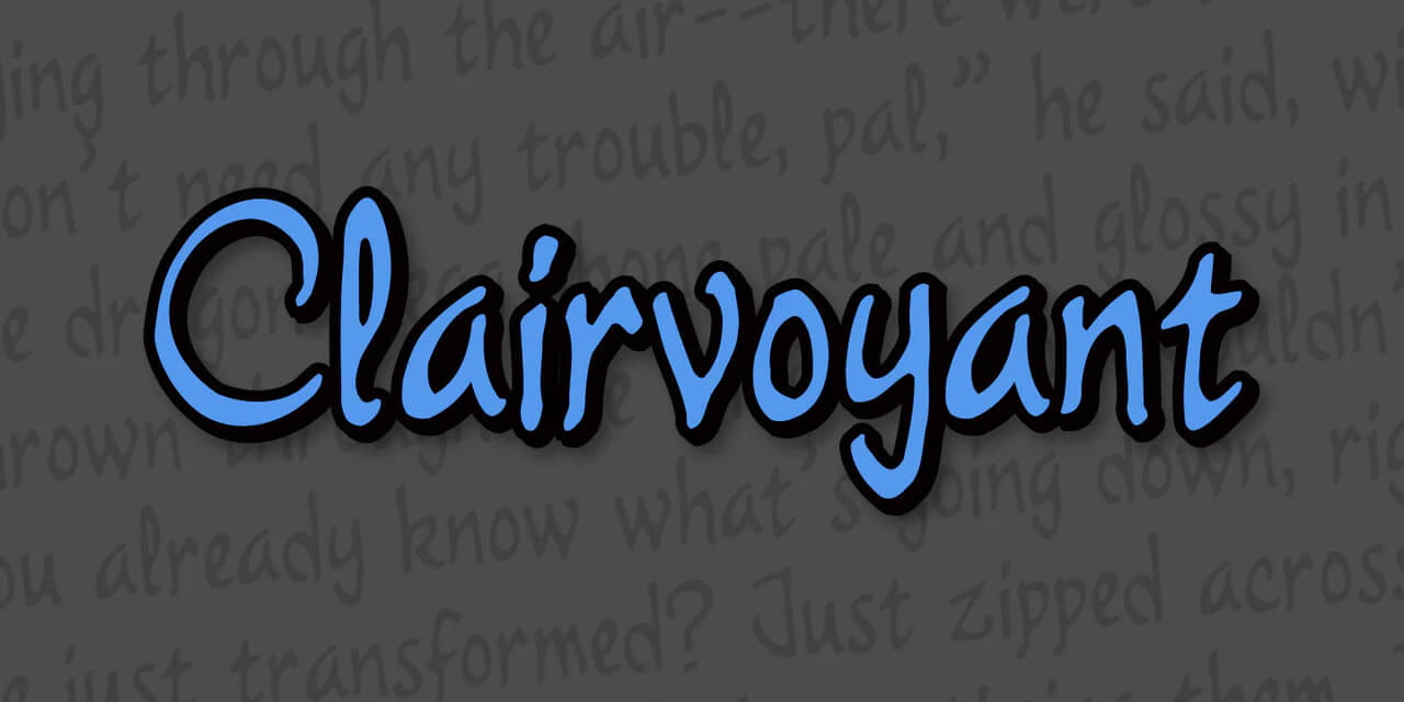
I’ve been able to use it a couple times since then: Joan of Arc in Requiem of the Rose King, and the Forest People in Prince Freya. Unfortunately, it’s such an unusual font that I don’t have the opportunity to use it very often! Hopefully someday I’ll be able to work it into Skip Beat! or Natsume’s Book of Friends.
Tools of the Trade
What is your favorite tool that you use for lettering?
The physical tool answer is my Wacom Intuos drawing tablets. When I started in 2005, I used an Intuos 2 tablet, the largest available at the time. 16 inches, I think? It was an absolute workhorse that I used until 2022, when I finally had to replace it, but only because Wacom stopped updating the drivers.
Now I use a 15-inch Intuos 3, which had an updated driver available for Windows 10 when I finally upgraded to my third work computer. I know the Intuos 3 is very old too, but I already had the Intuos 3, so there was no need to buy a new one.
The software tool answer is the Photoshop pencil tool. The hard edges make for precise lines when retouching artwork. I’ve been using it to create sound effects lately, too. 3 points will match most manga line work, and is the size I most often use for that purpose. If I’m imitating messy brushed ink styled FX, then the pencil tool is definitely the best way to go.
In the past year, I’ve been learning Clip Studio Paint. I’ve used both its screen tone removal tool and the tone→grayscale→back to tone tool for artwork retouching. CSP is a very powerful program, and I still have a lot to learn about it.
What do you wish you’d known when you first started lettering?
A couple things! First, font choices. I did have a varied selection of fonts left over from my graphic design classes. When I began those sample pages, I went online and found more. Thanks to those classes, I knew to keep an eye out for legal issues with fonts, and I landed on Markerman for my main dialogue font. I had no idea how heavy and bulky it was. It was free for commercial use and looked fine to me, so I used it! It ended up being the main font for all of my early works. I still use it for Skip Beat! and Natsume, as those series are ongoing.
I made an unfortunate choice for flashbacks in Nana. The editor, Eric, wanted the same font used for everything. So it was Markerman for regular dialogue, hand-written asides, and thoughts. The thoughts weren’t even italicized! I was so relieved when he didn’t mind my adding new fonts for emotion…and for the flashbacks.
With my little font library, I landed on Mistral [for the flashback font]. But the serifs on that font can make it difficult to read. After setting the type in Photoshop, I would zoom in and cover up all the serifs by hand with the brush tool on a new layer. It took forever, and if I needed to move a line of dialogue around, I’d have to remember to move the tweaks, too. If Eric wanted the words changed in corrections, then…yep.
The second thing I wish I’d known was that things would be okay. I was so incredibly nervous when I opened my first page of Nana and realized my work would be seen by thousands, unchangeable, and would last for years in some form or another. What if I messed up? What if I did a bad job? What if people hated it? I’d be frozen with anxiety for a full minute before I could work. That anxiety lasted for about a week.
I wish I could go back in time to give past me a hug. It will be okay! Relax! Enjoy your job and do your best!
Article Editor: Adam Wescott
Big thank you to our supporters
From their continous support, we are able to pay our team for their time and hard work on the site.
We have a Thank-You page dedicated to those who help us continue the work that we’ve been doing.
See our thank you page